The band wanted the logo on the EP - because of the shape of the logo and the standard size of cd cases, I had to work around a lot of blank space. Using the ep title and the band name seemed to be the way to fill the space, but if they were too big, they would have been competing w/ the logo. Enter the compass-y design. Not overly thrilled with the front, but I am pretty happy with the inside info insert - I think using the lightning star was a good tie-in to the cover, but didn't make it too overused. I always loved the RKO Radio-Pictures logo that played before King Kong and bunch of other classic horror movies, so I swiped it for the insert. Simple fonts kept it from looking like they were FONTS. I hope. Anyway, about a week's worth of work, not counting the logo design that was done months ago and just touched up recently. I think it still needs one more thing touched, but I'll get to that later.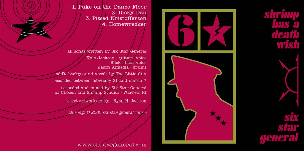
posted by jax
4.22.2005
Subscribe to:
Post Comments (Atom)


2 comments:
you have to blame that one on my brother - he emailed me the liner notes, I just cut and pasted them into the graphic - Sorry!
I take responsibility for that one. Just think the first 50 prints of that ep will be selling for $50 on ebay ten years from now, because of the misspelling.
Post a Comment